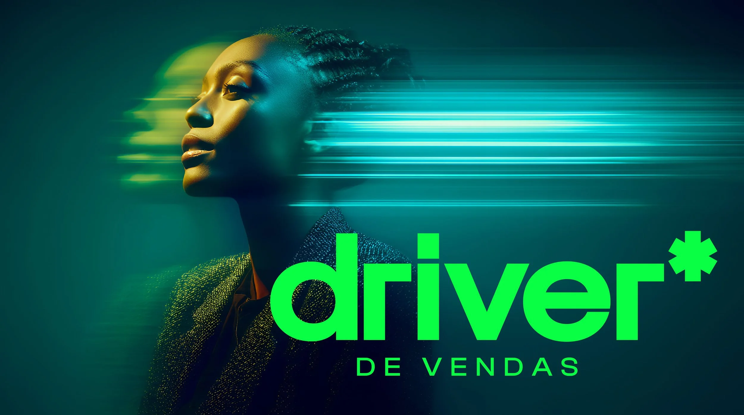
driver de vendas

Driver de Vendas helps B2B companies stop guessing and start scaling. The brief was to build a brand that matched that ambition: sharp, high-energy, and unmistakably modern.
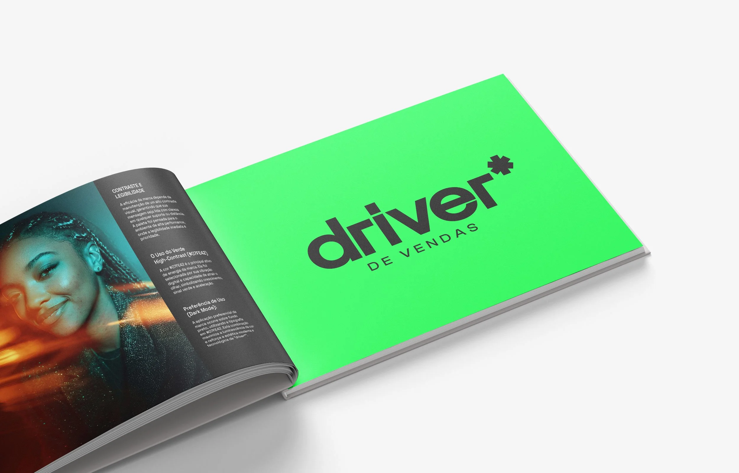
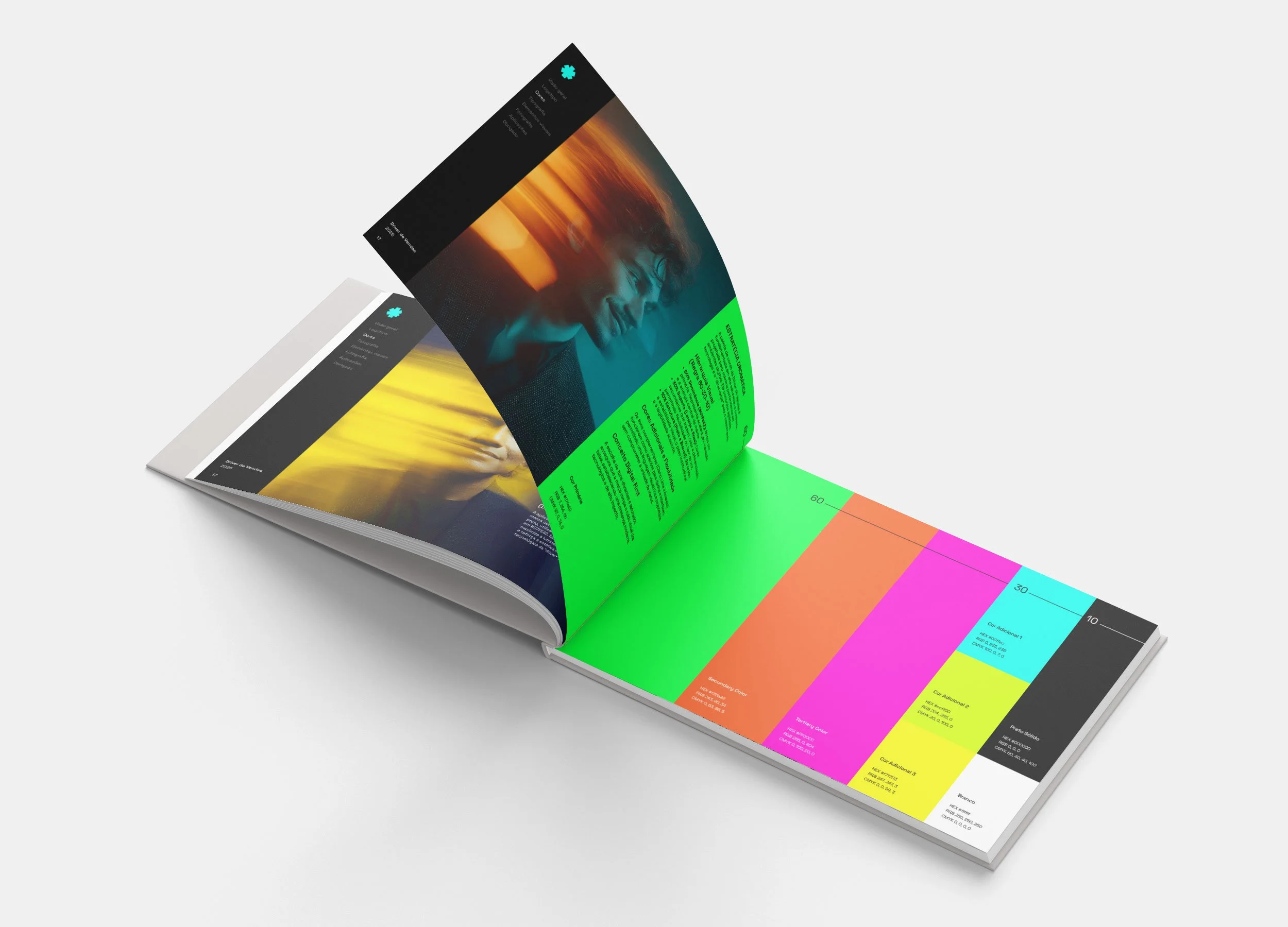
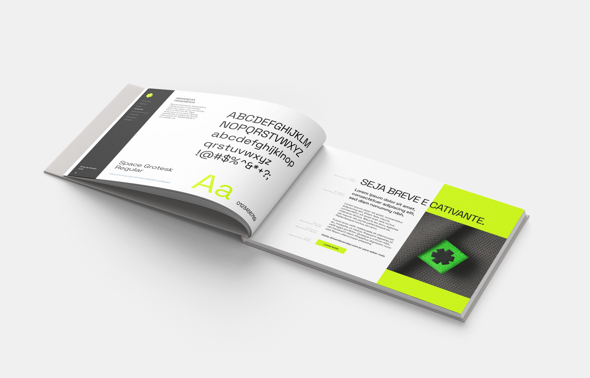
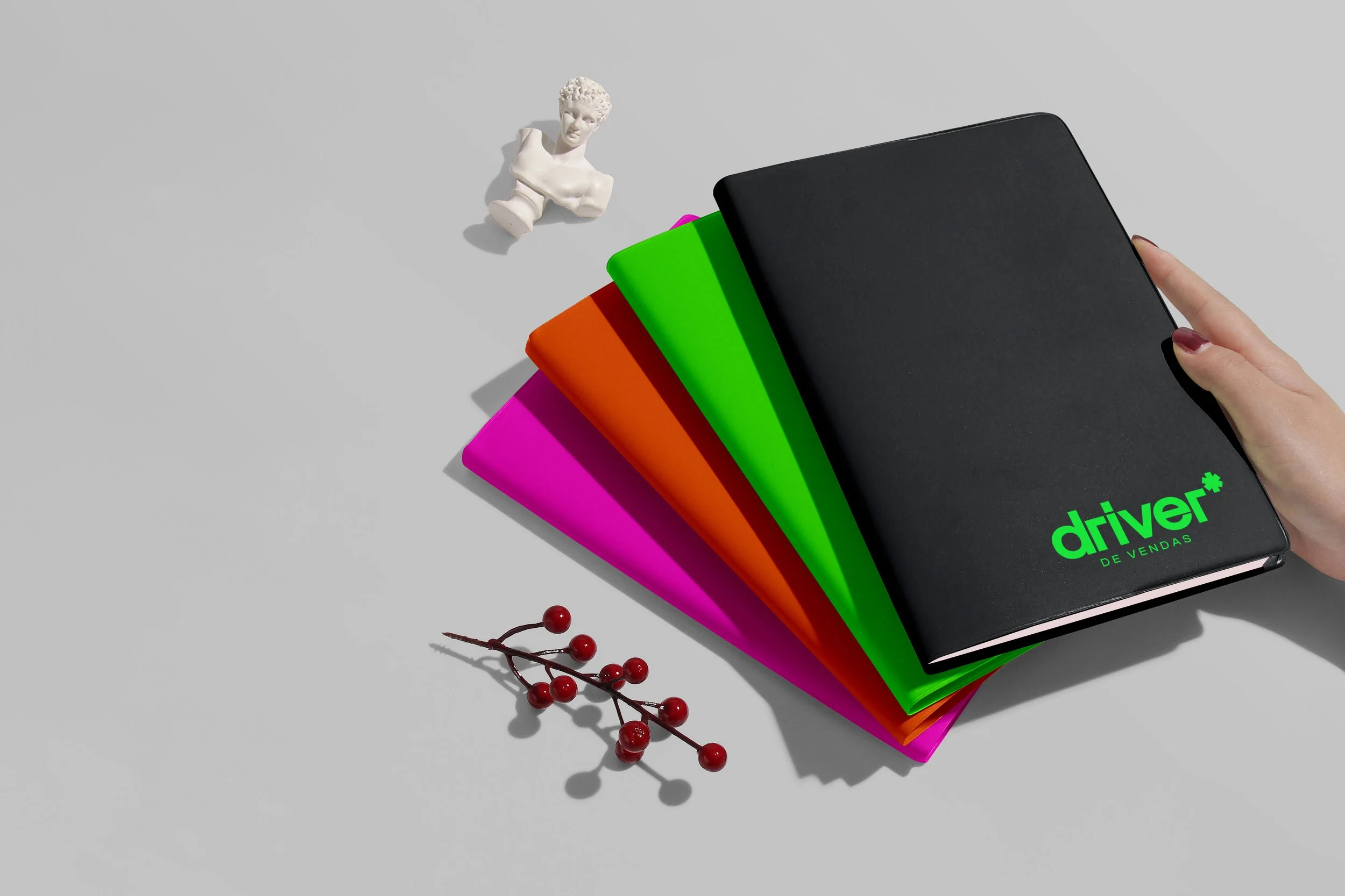
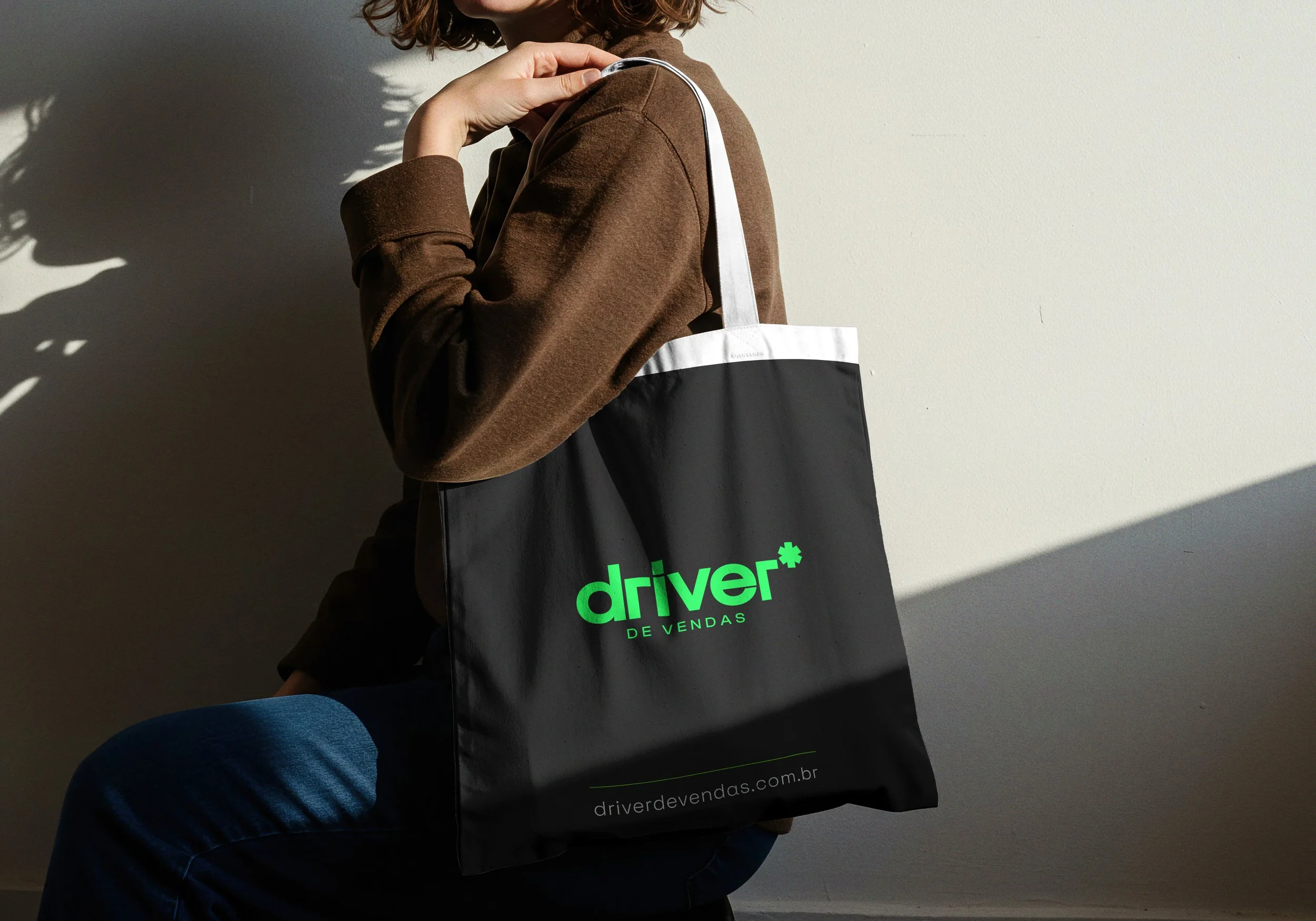
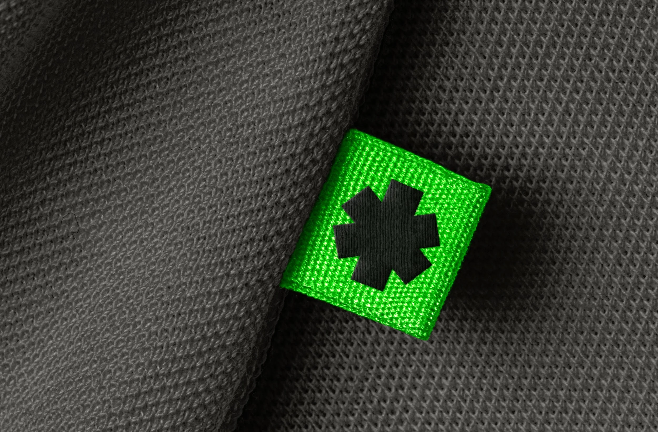
The identity centres on a custom logotype with an asterisk as its signature mark — a symbol that carries multiple meanings at once: precision, expansion, a wildcard, and the "something more" that sets a brand apart. The primary colour, a near-fluorescent green (#07FE42), was chosen for its digital vibrancy and its literal signal: green means go.
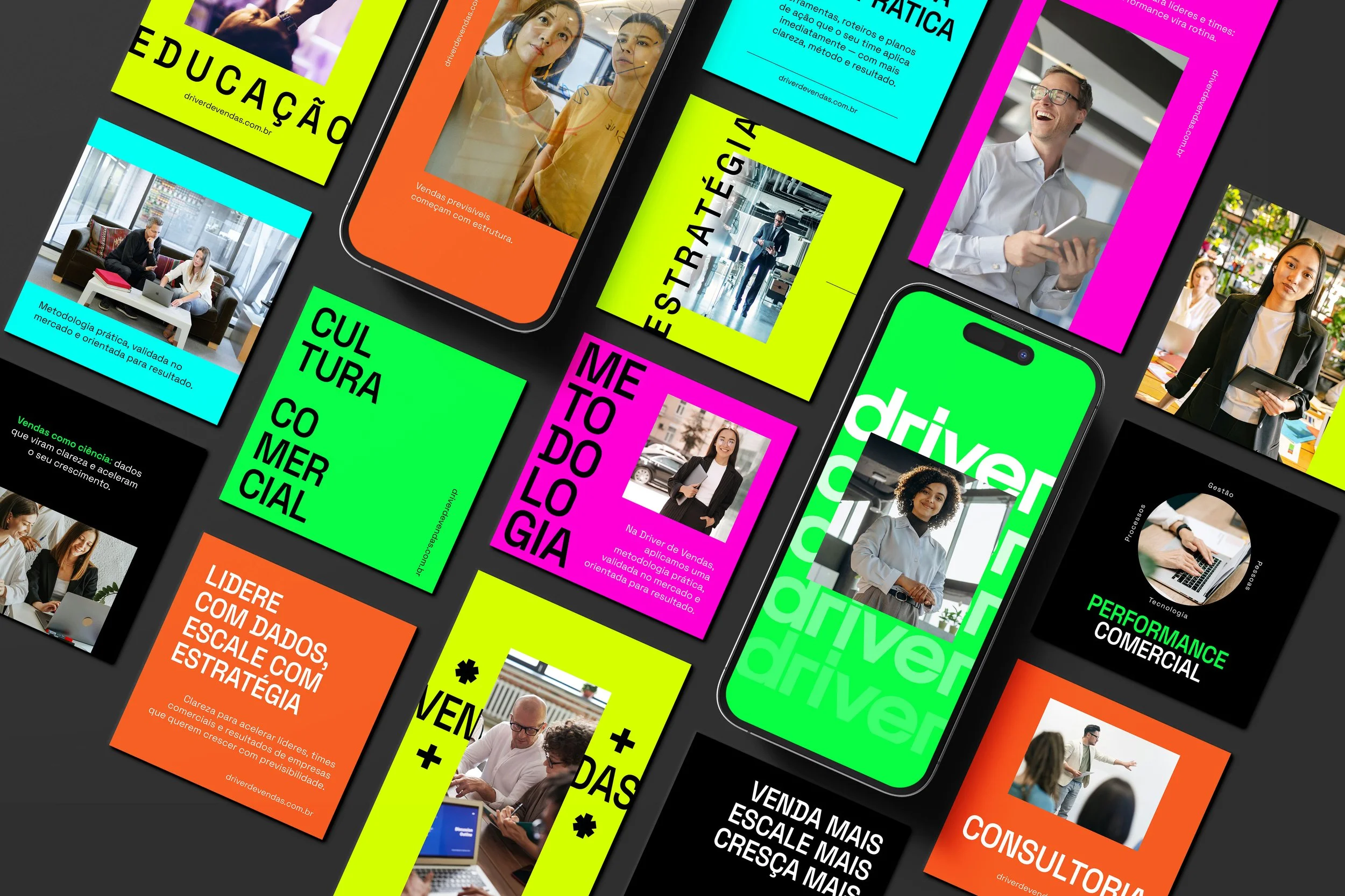
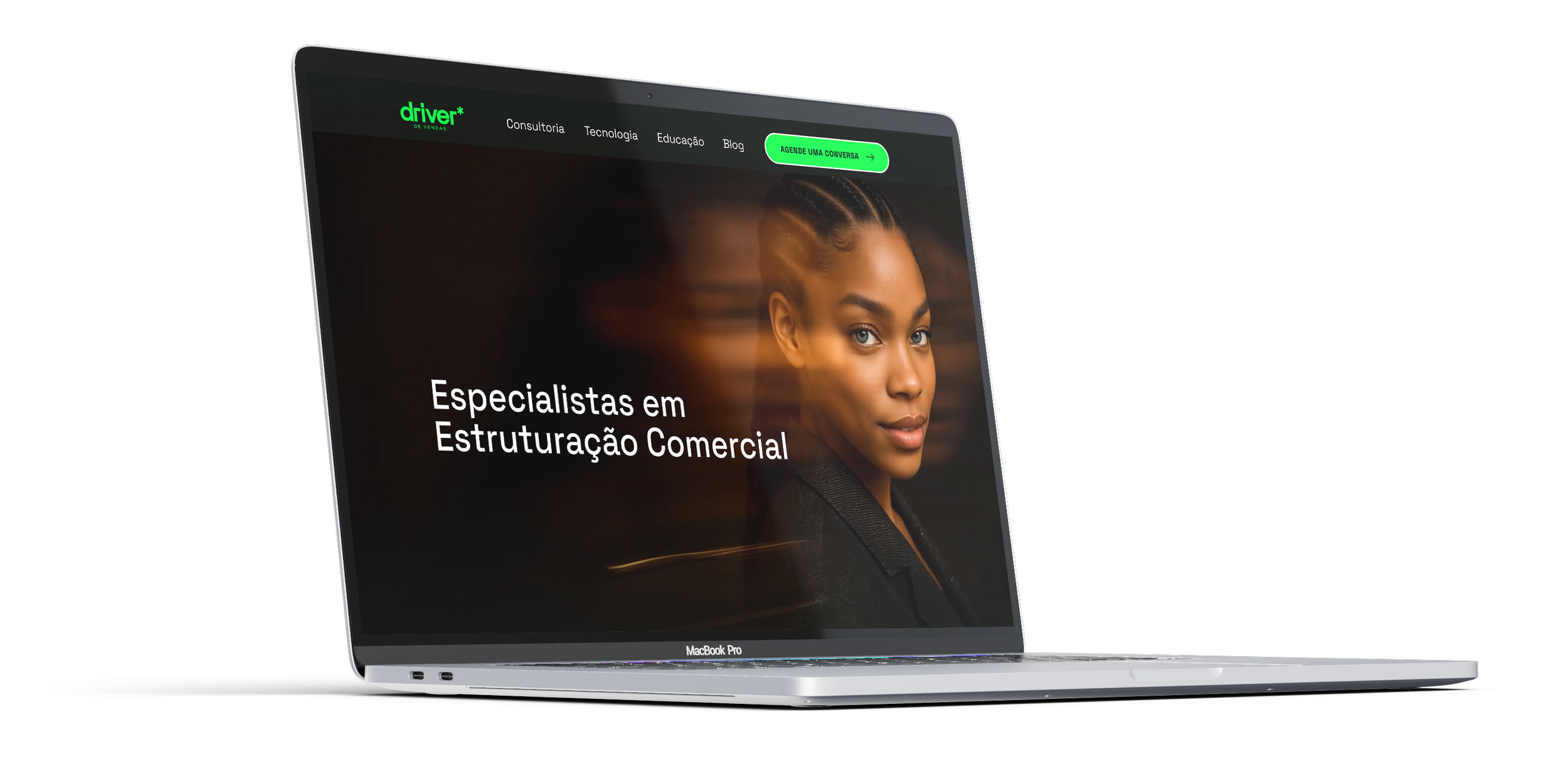
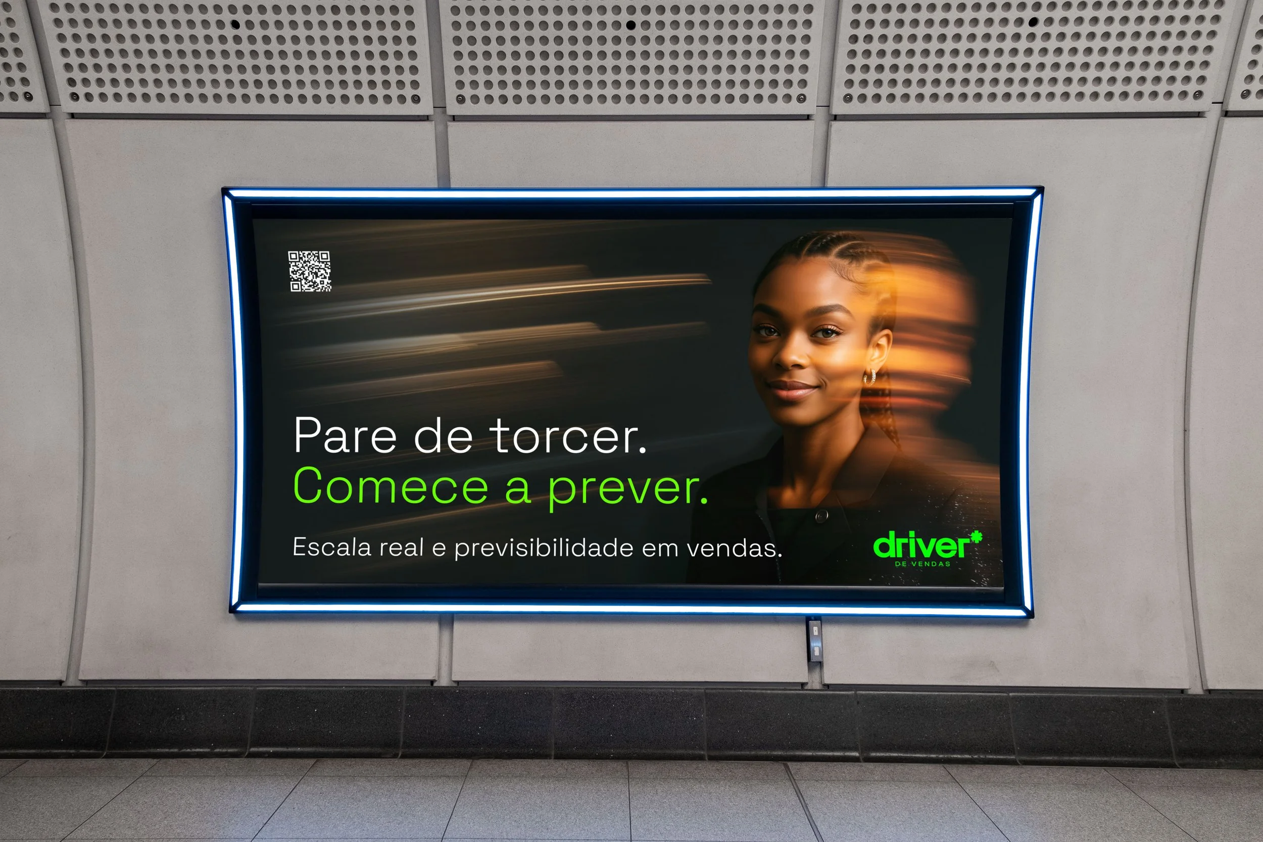
The visual system is built for dark mode first, with a layered photography style that fuses motion-blur portraiture with bold typography — giving the brand a kinetic, high-performance feel across social, web, and print.
The website translates the brand into a clear commercial narrative: four strategic pillars, a proven methodology, and a direct call to action for business owners ready to build a predictable sales operation.
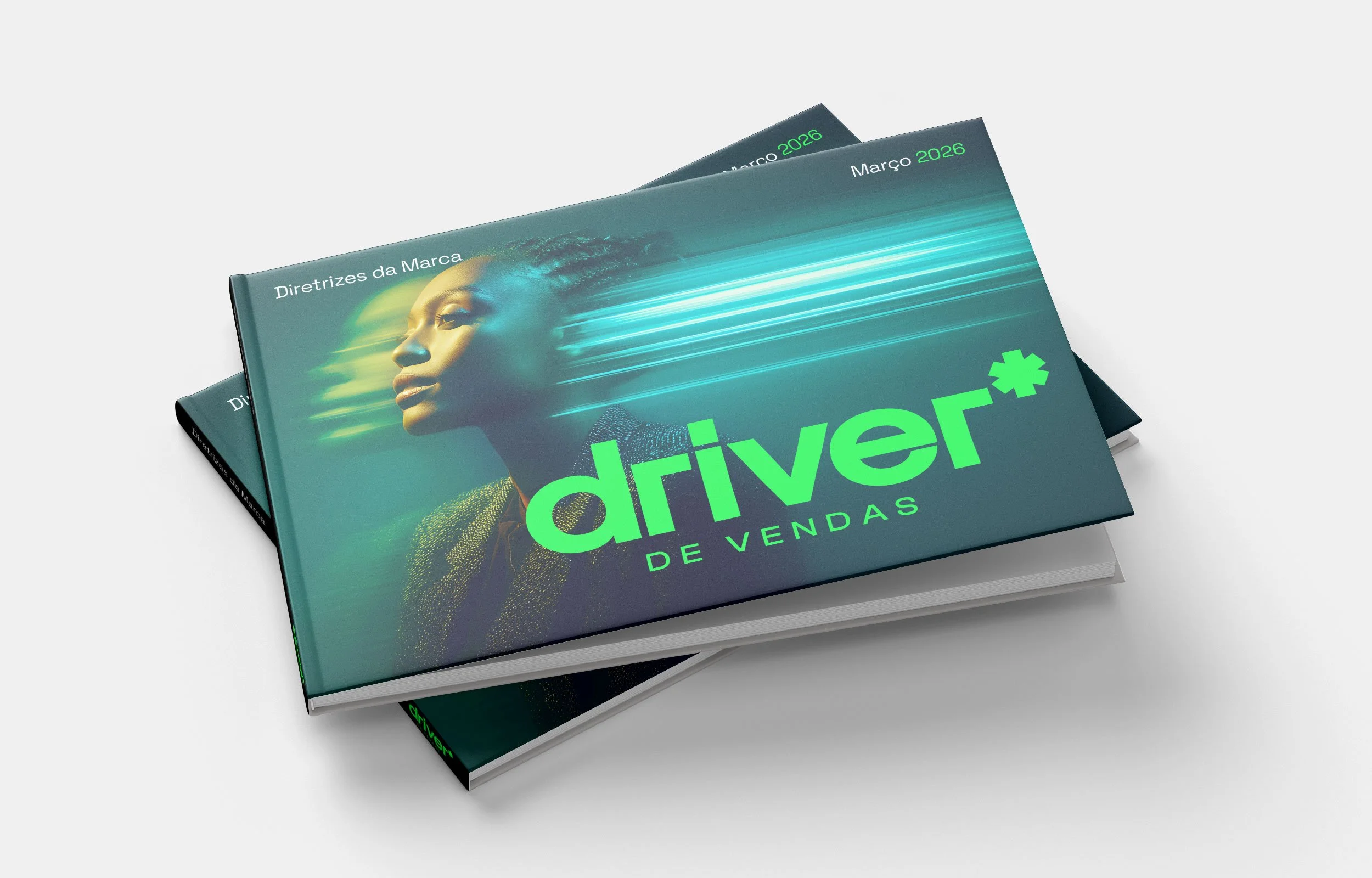
Deliverables: Logo & brand mark / Colour system / Typography / Photography direction / Brand guidelines / Website design / Social posts templates
Branding
2026